Context
Projeto Fio was conceived as a socially rooted fashion brand structured around embroidery as both cultural practice and economic strategy. Founded alongside Marina Bittencourt, Olivia Silveira and Leticia Ozório, the brand was built from the ground up to integrate creative authorship, collective production and financial autonomy of women artisans.
From its inception, the objective was not only to create garments, but to design a brand system capable of connecting identity, production and long-term positioning within the cultural and fashion landscape.

Strategic Foundation
Projeto Fio was designed to sustain a dual structure: a fashion brand with clear aesthetic positioning and a socially embedded production system.
Three core pillars — naturality, handmade processes and elegance through simplicity — were defined not as visual abstract values, but as operational principles guiding product development, communication and decision-making across the brand.
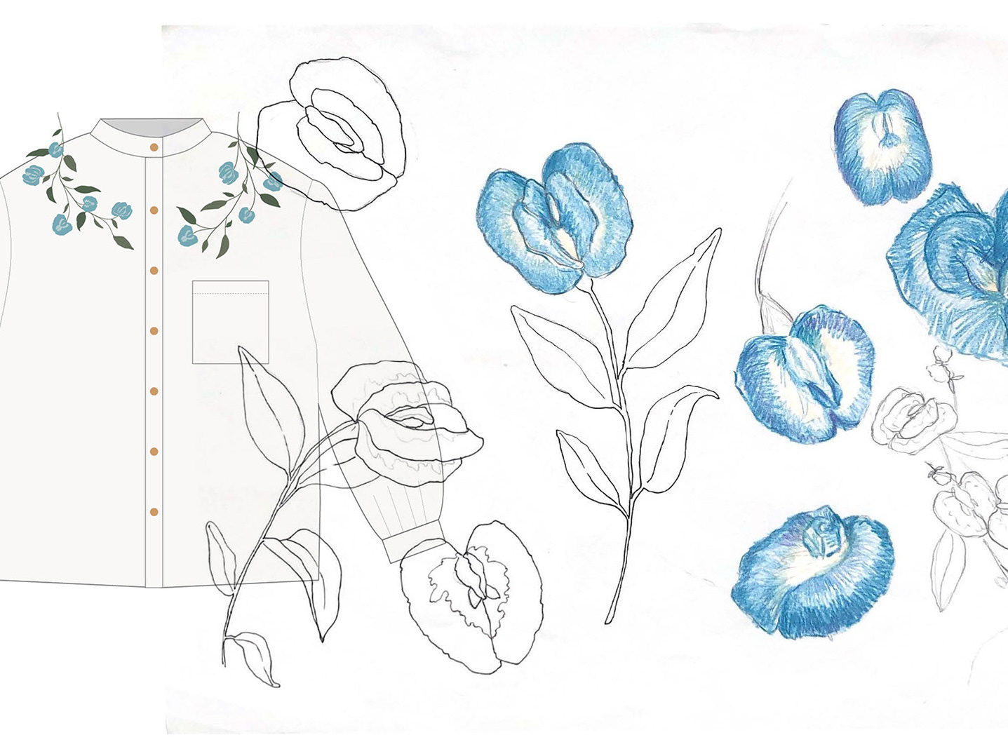
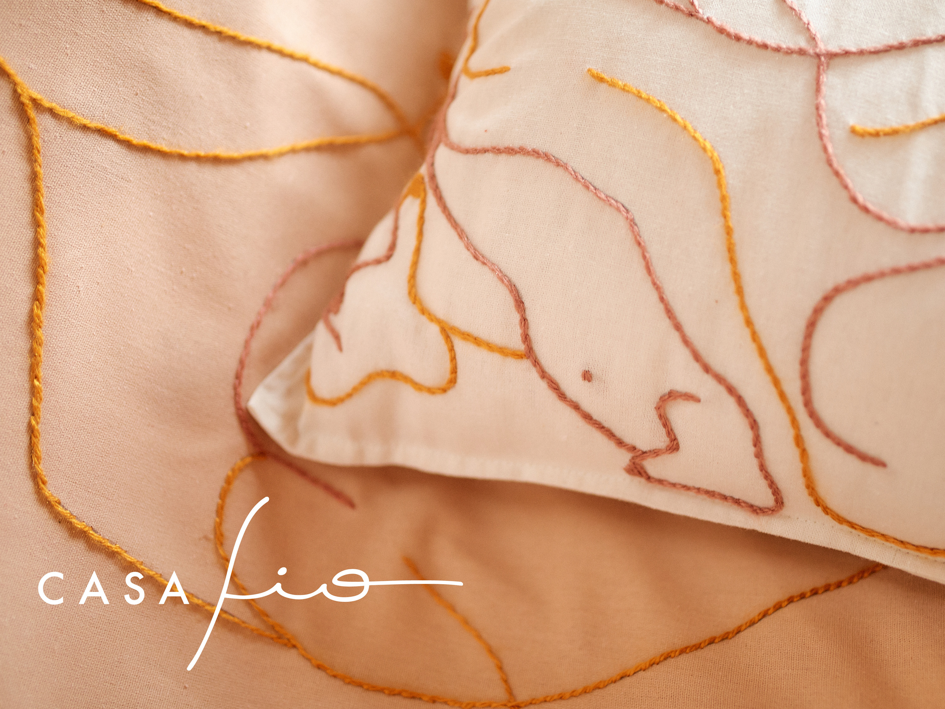
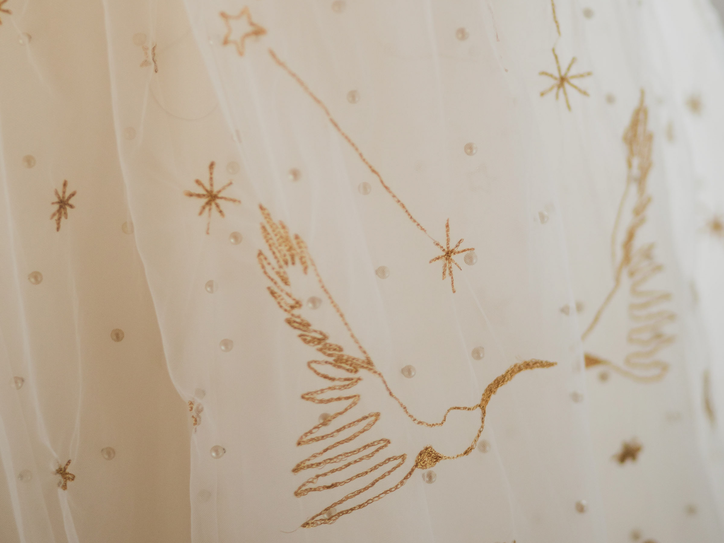
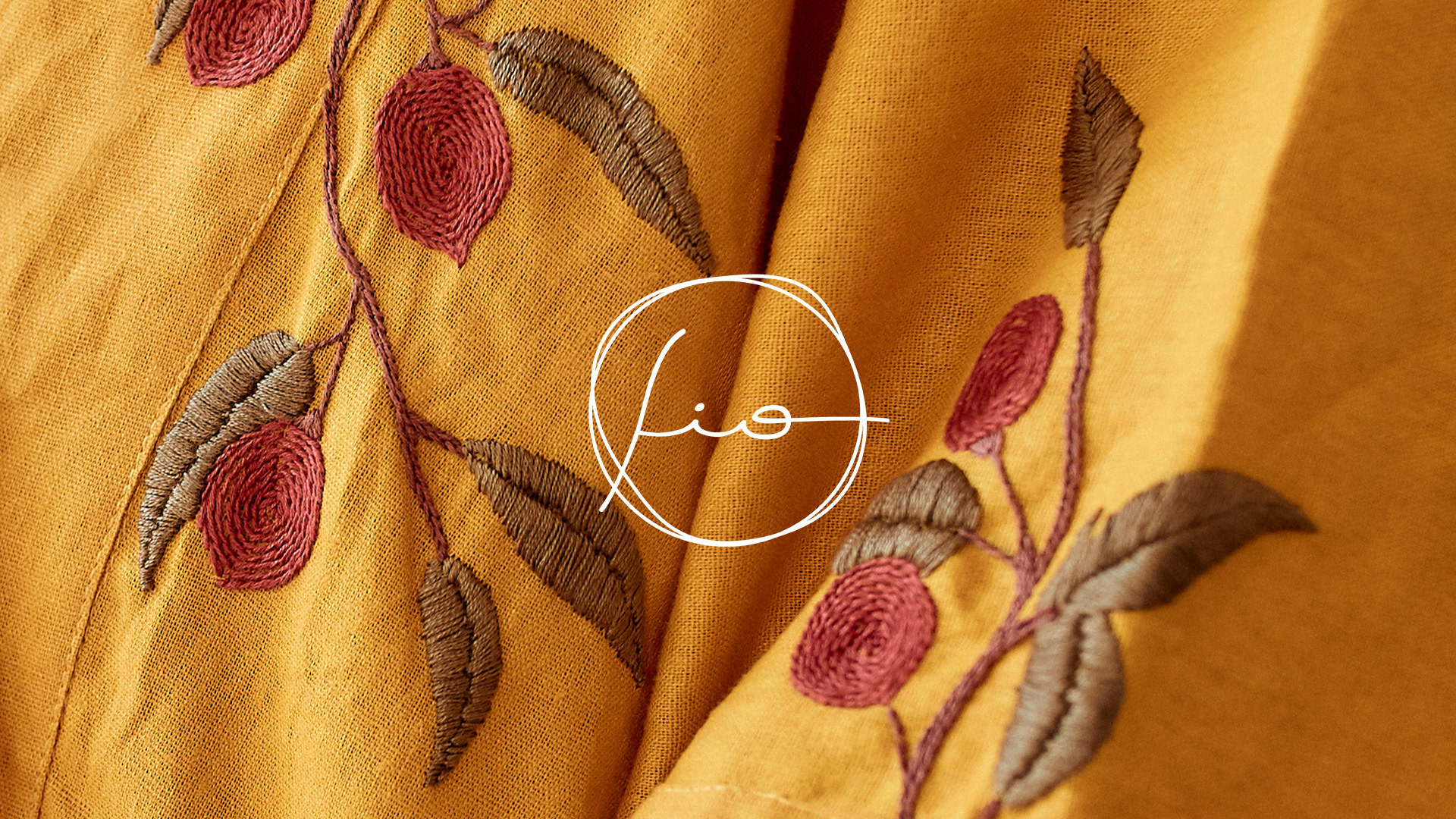
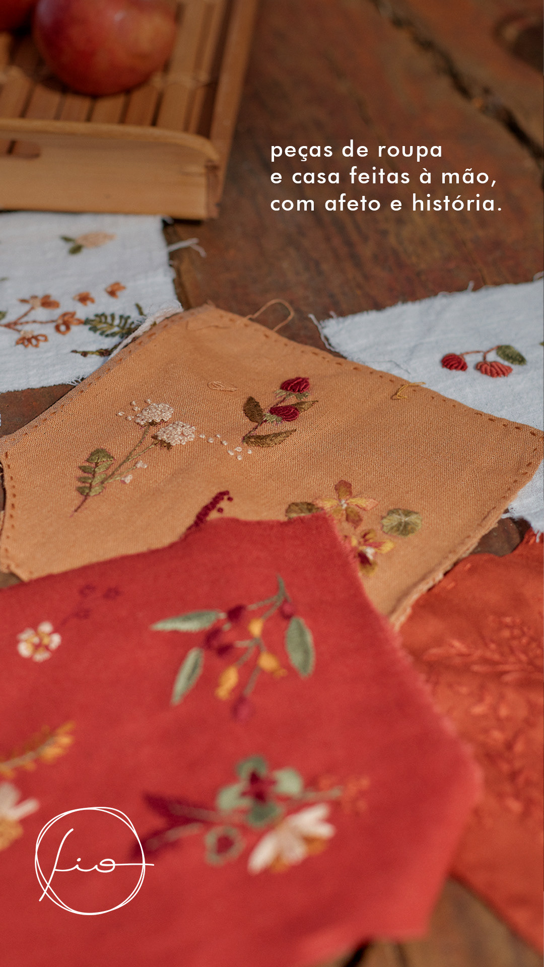
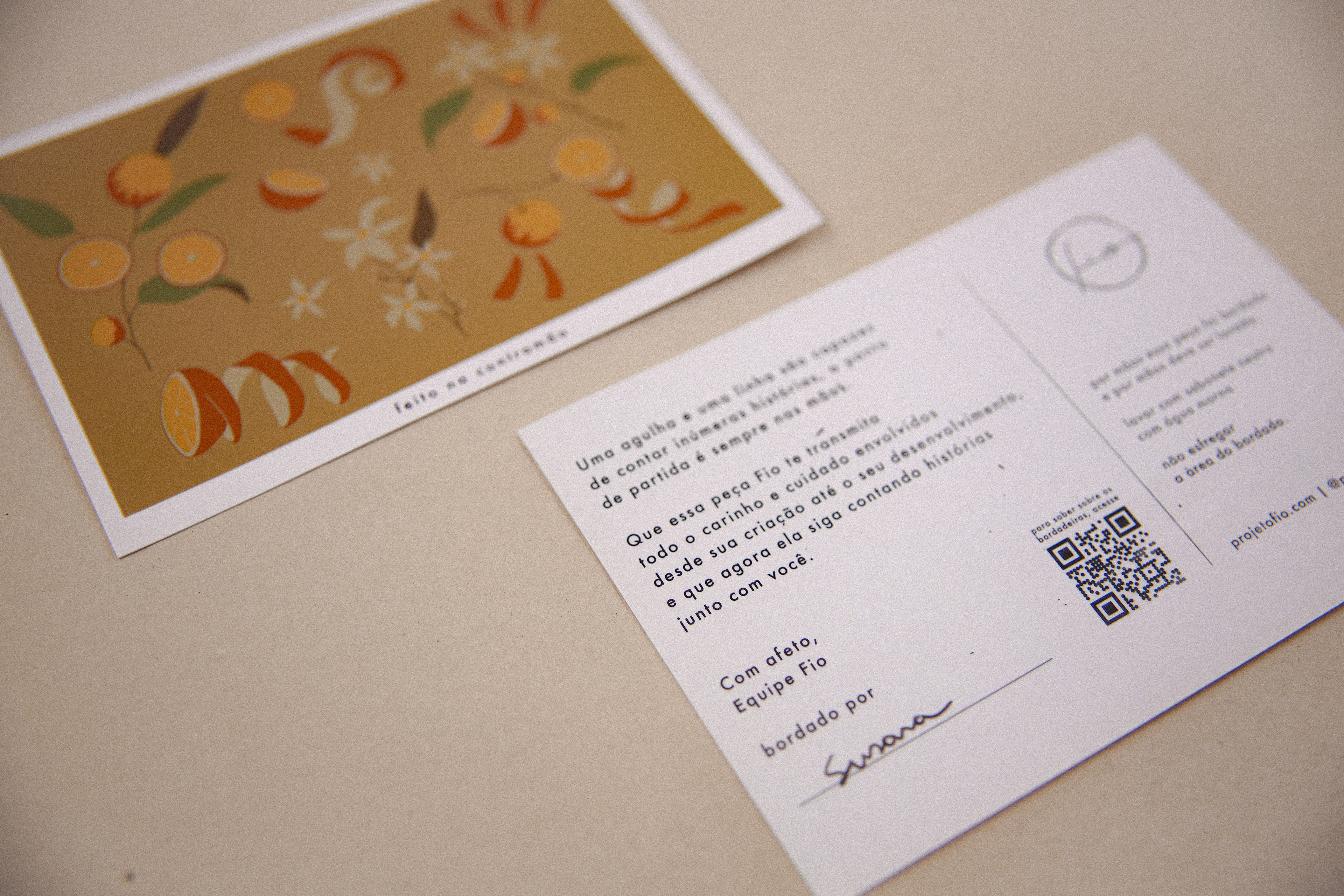
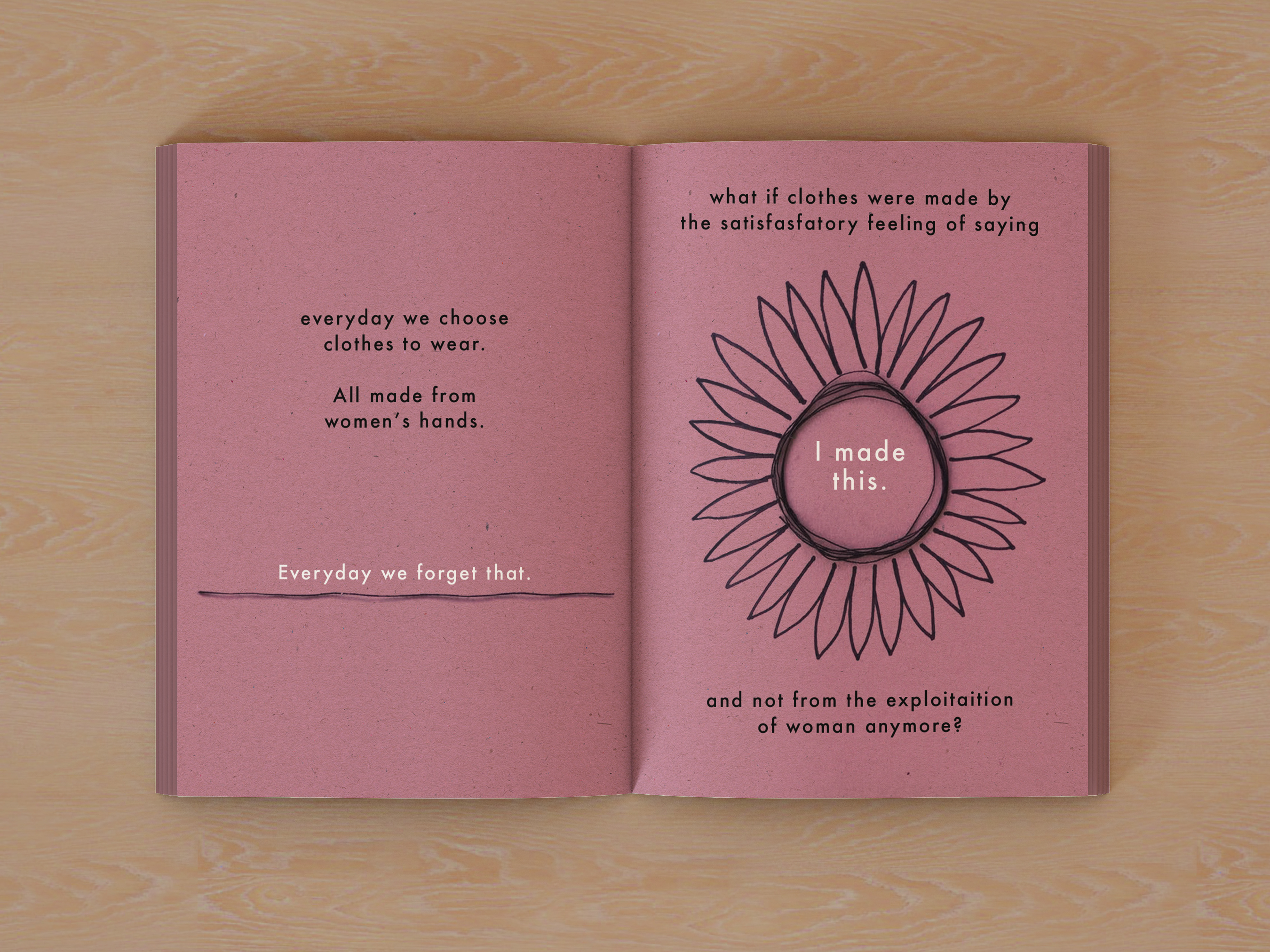
Embroidery was positioned as both cultural language and structural backbone: a medium capable of carrying narrative and authorship while supporting an economically viable production model.
This framework allowed the brand to align symbolic value, creative direction and social impact within a coherent and scalable system.
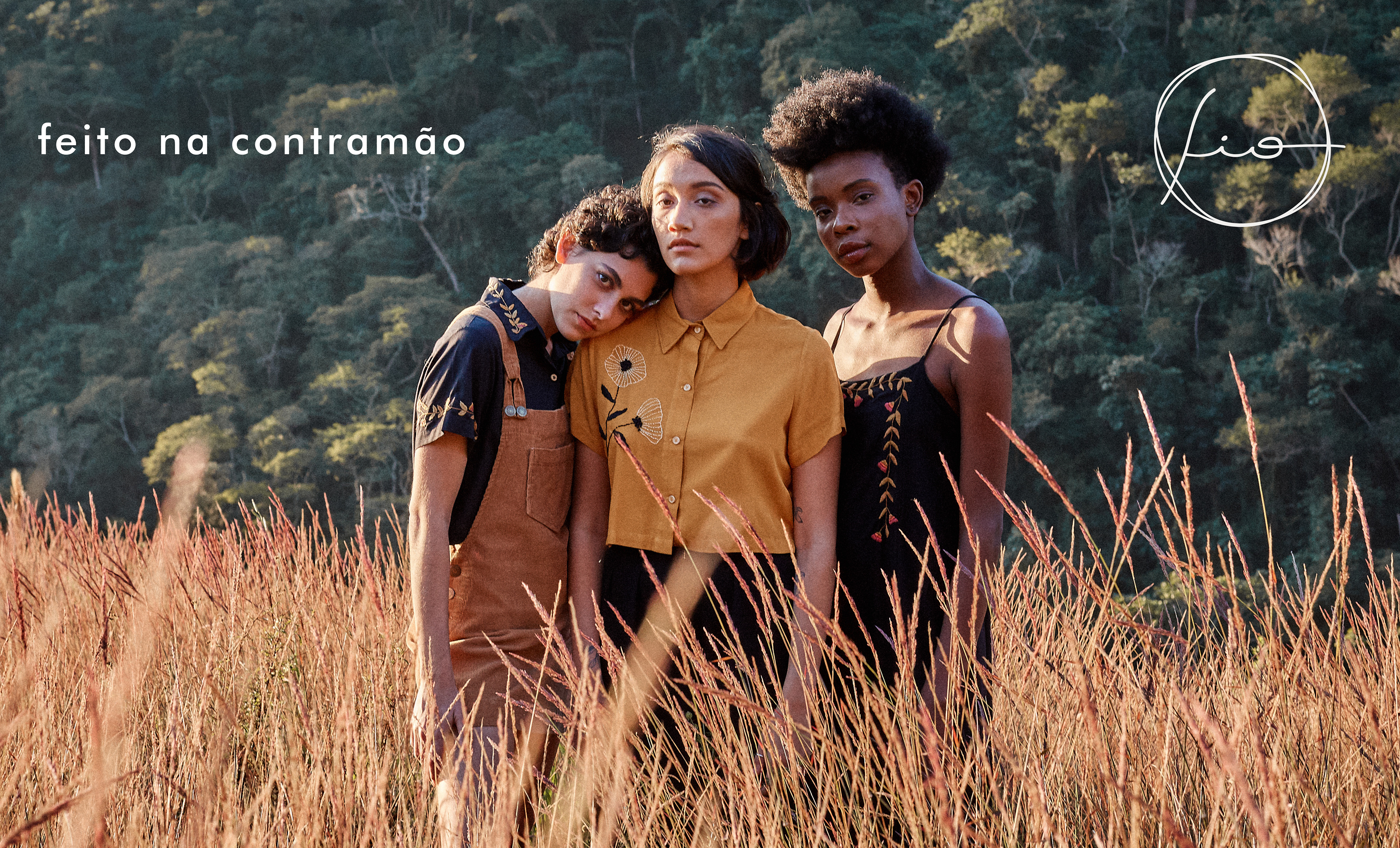
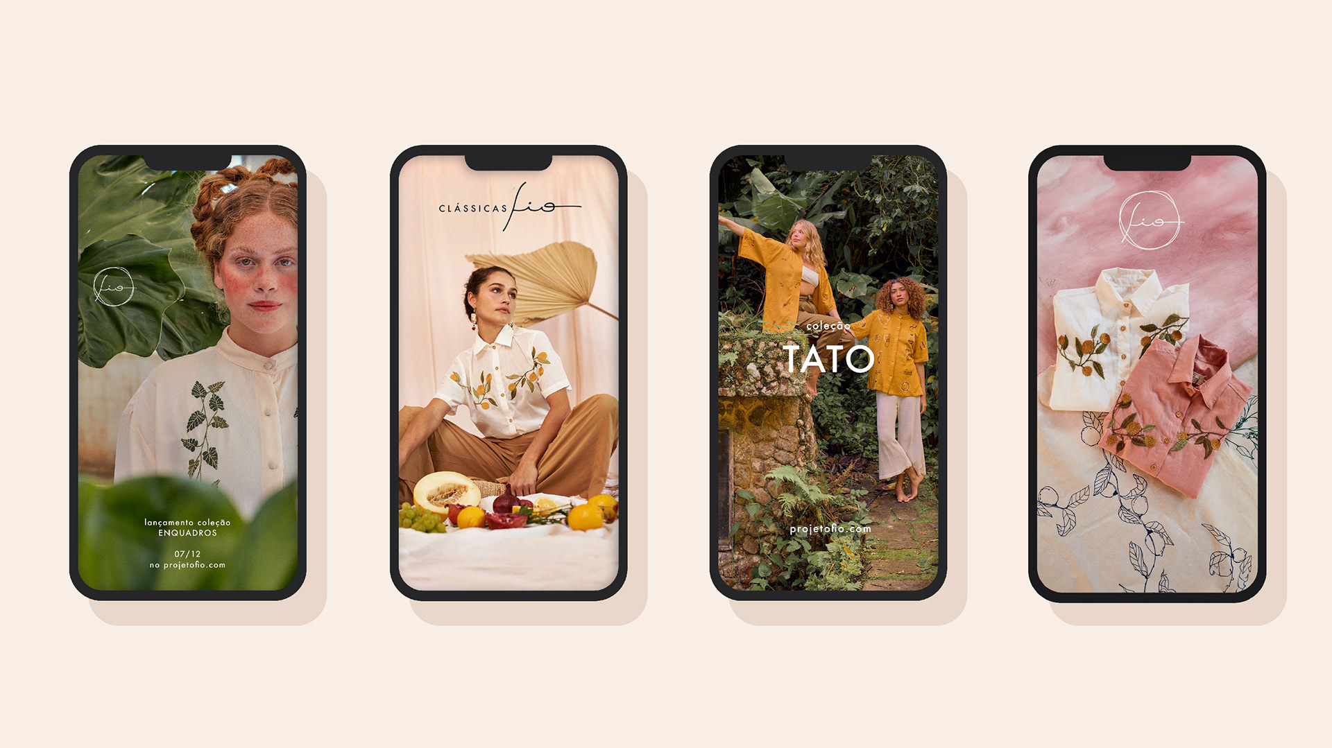
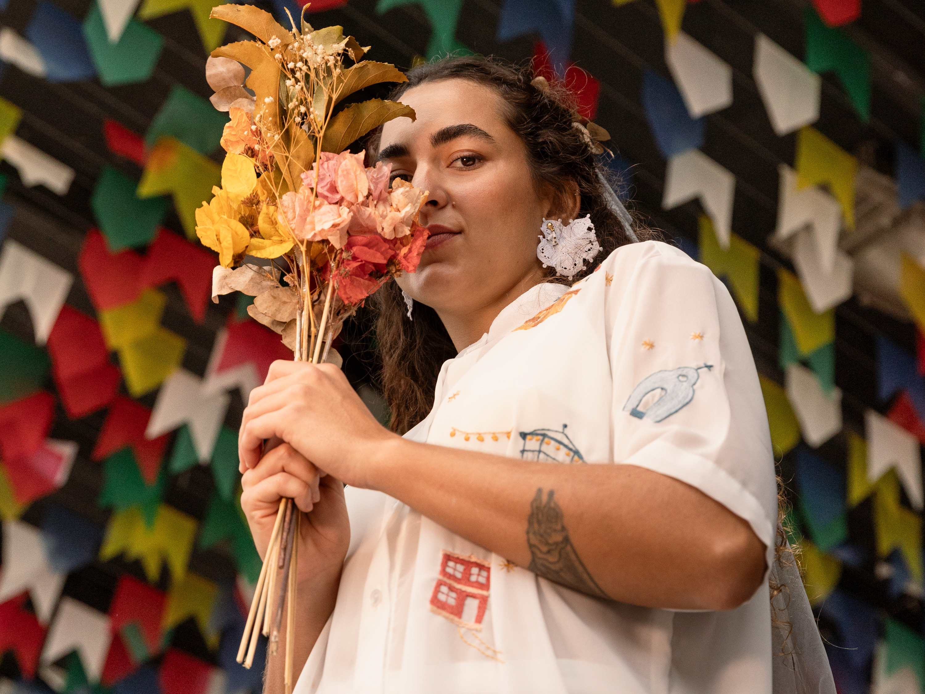
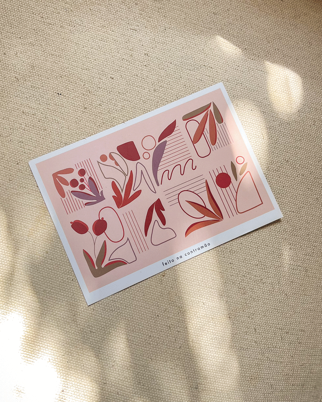
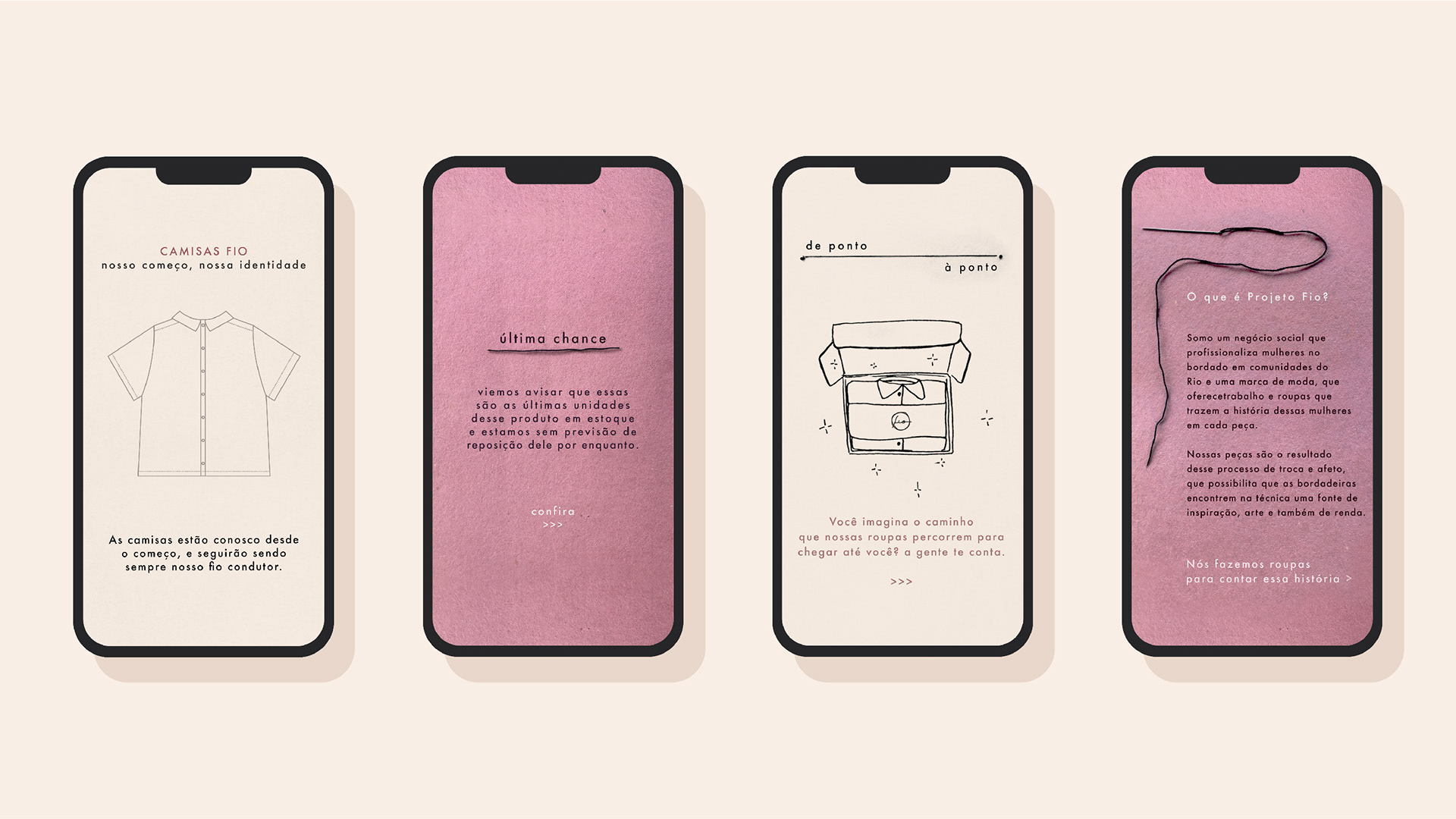
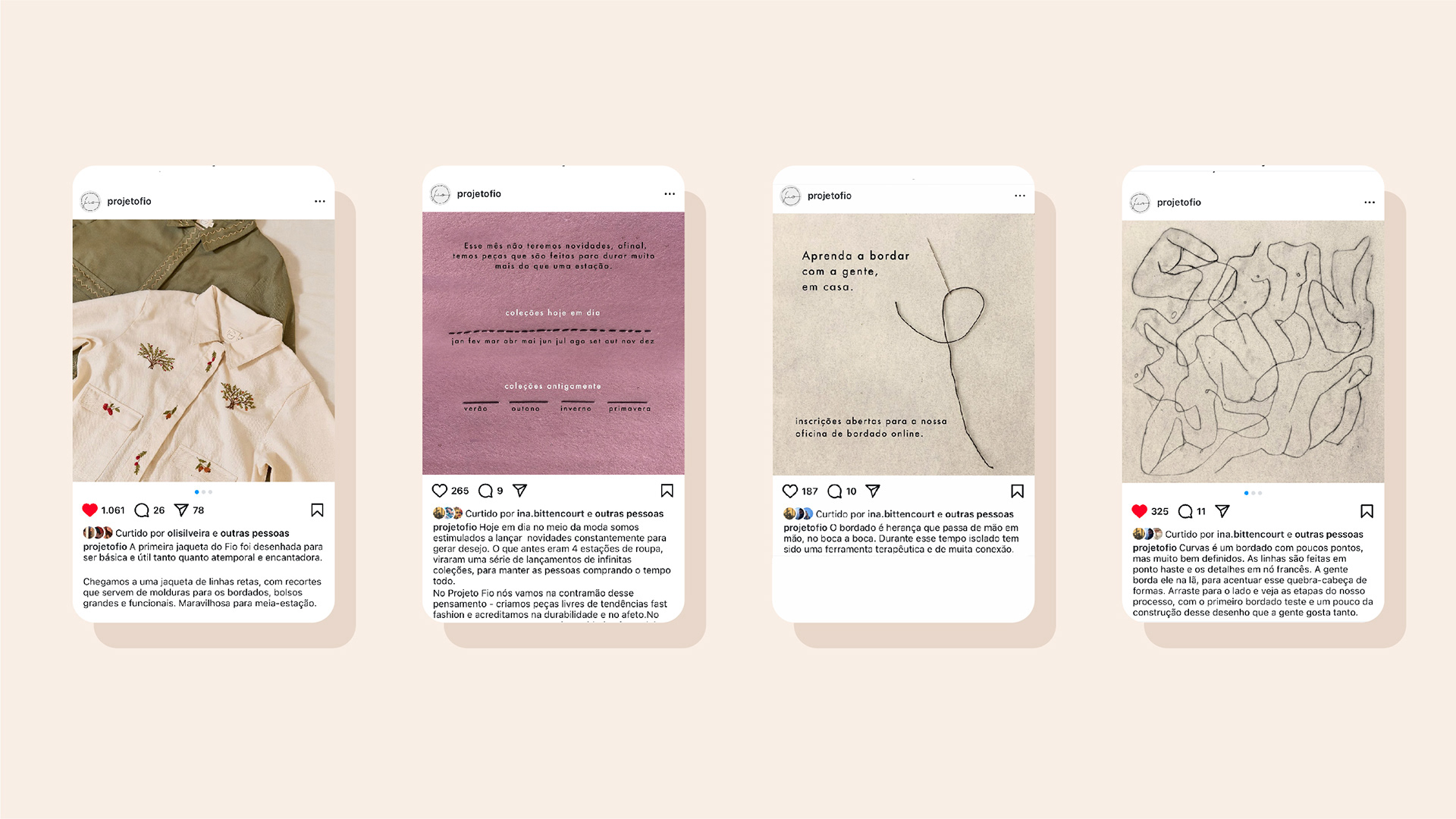
The visual identity was developed as an extension of the brand’s structural logic. Rather than imposing a dominant graphic language, the system was designed to frame and enhance the manual work at its core.
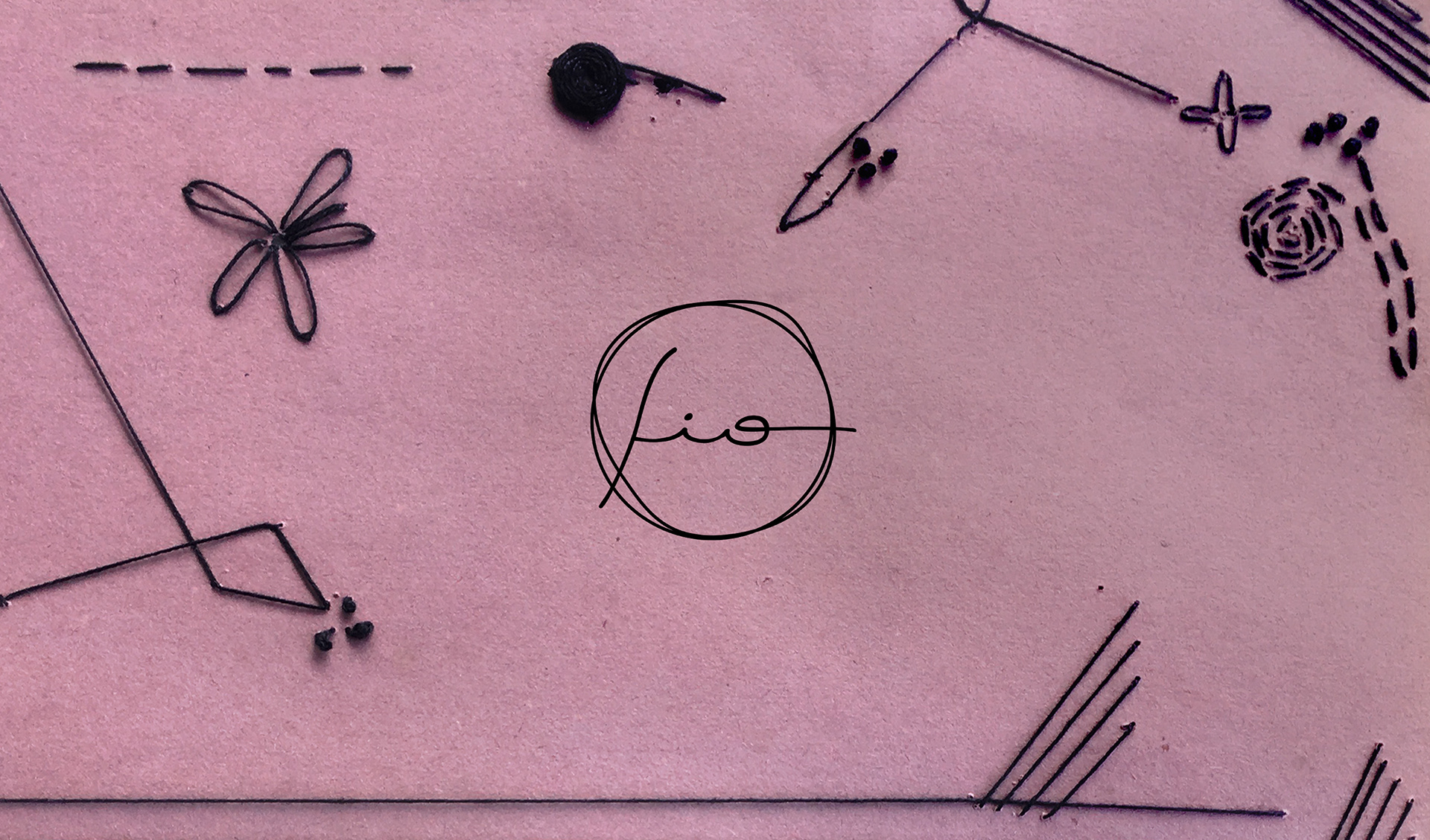
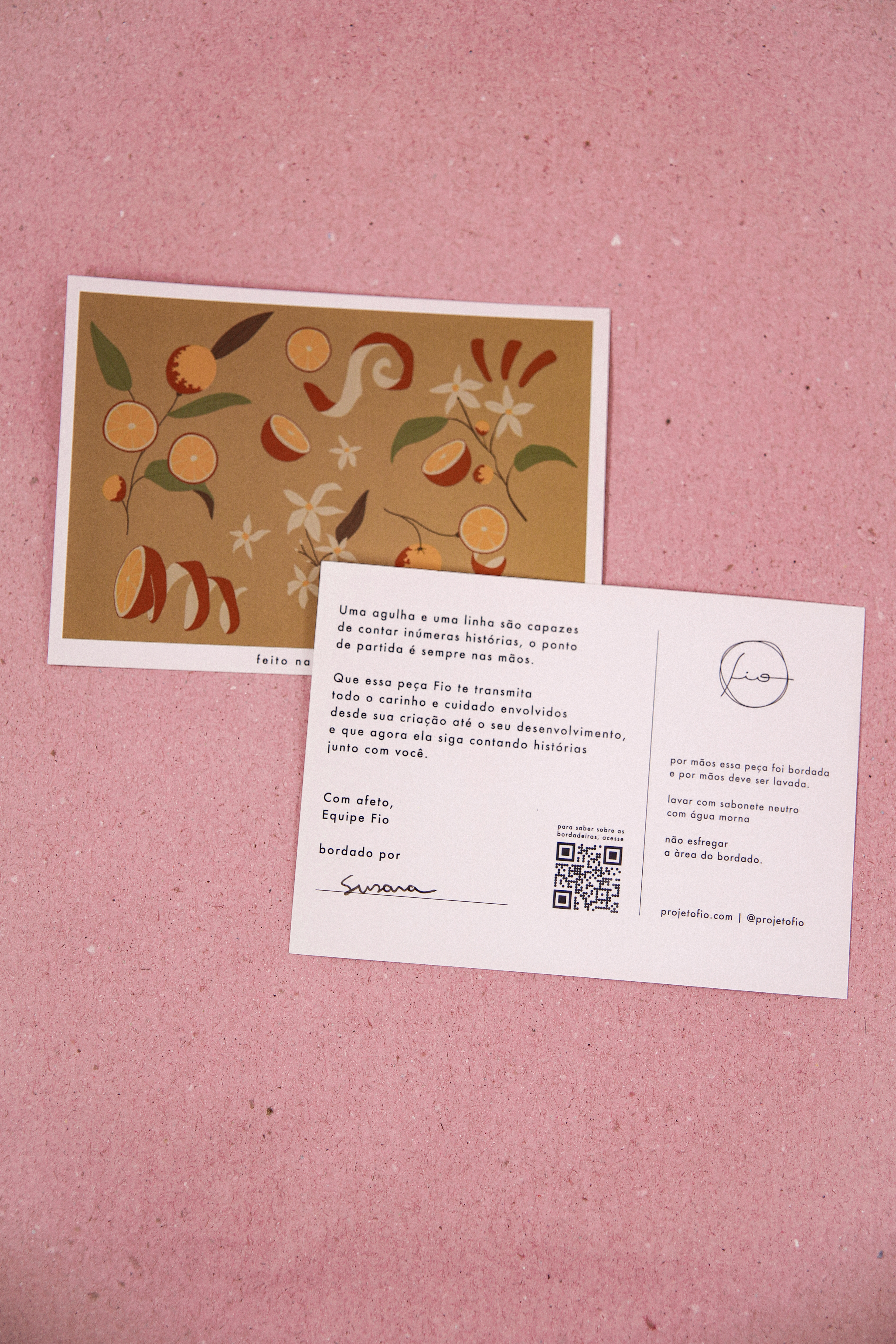
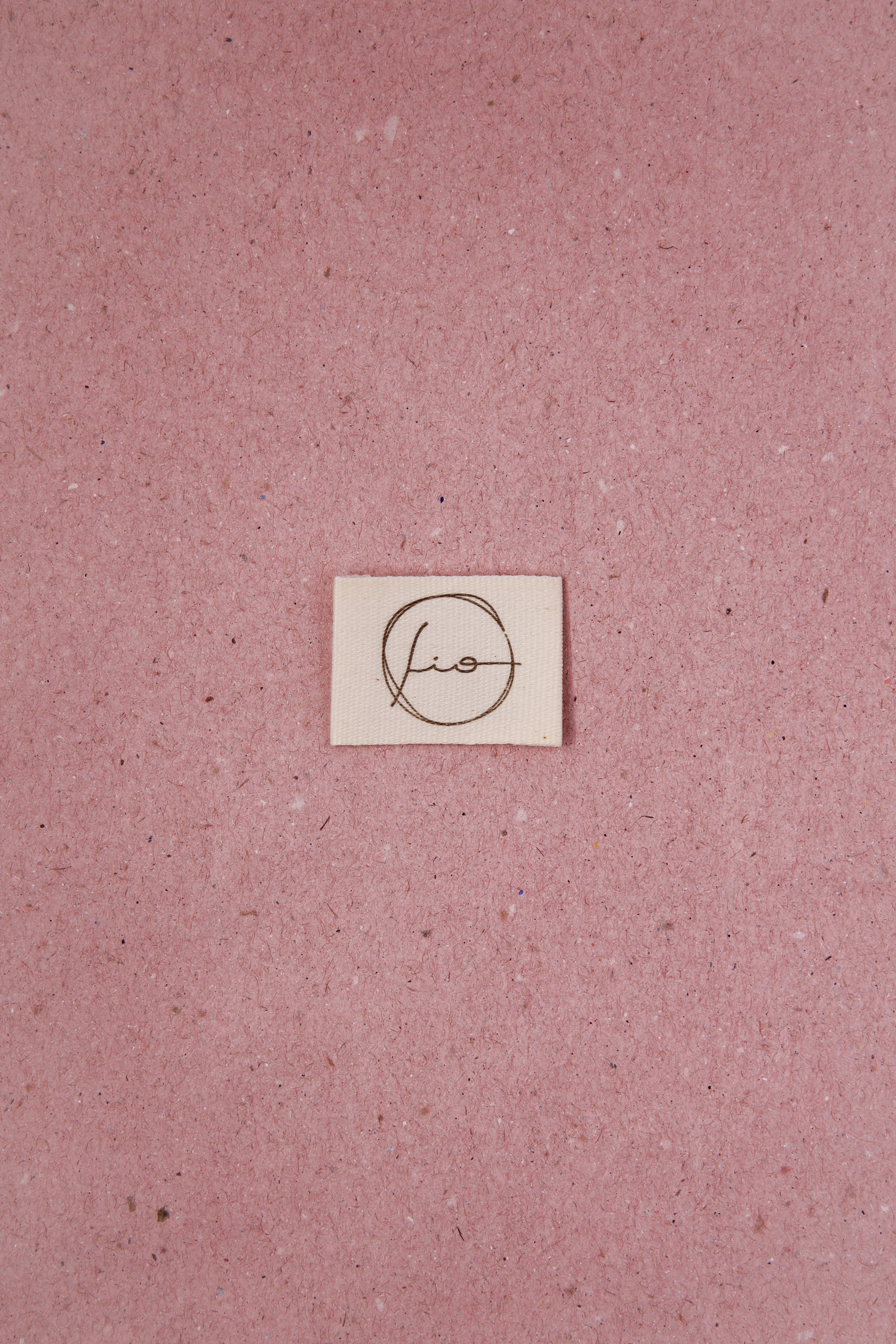
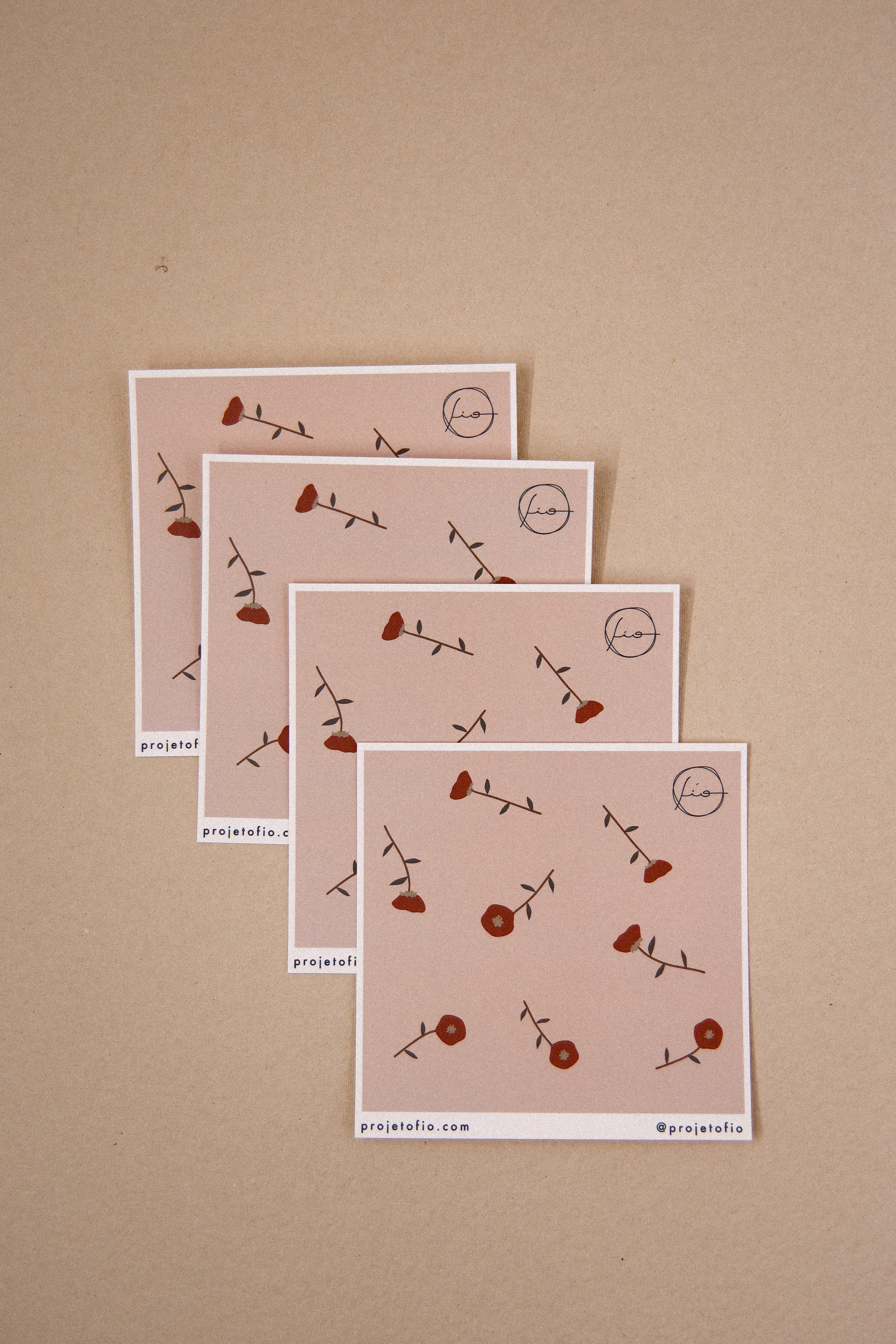
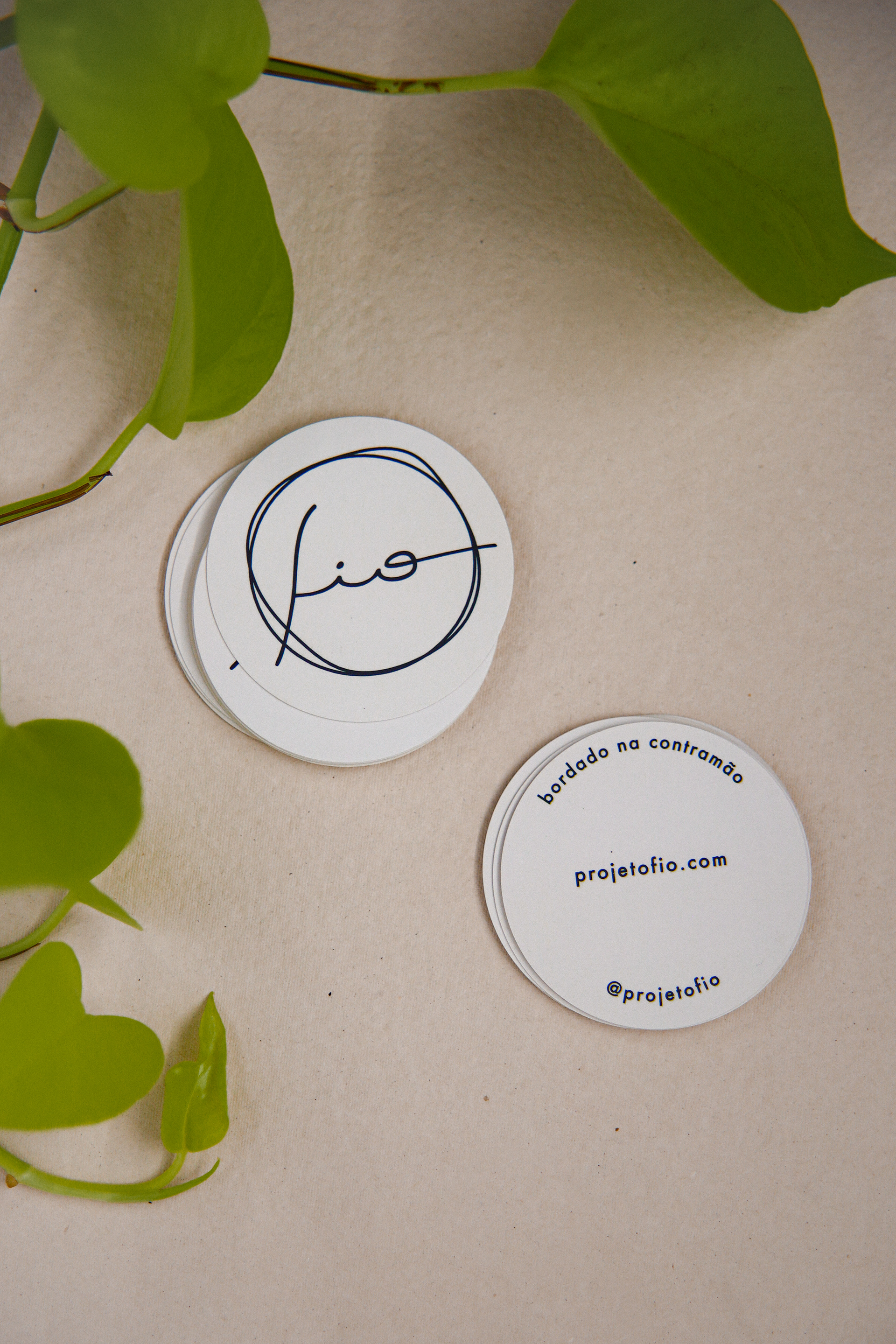
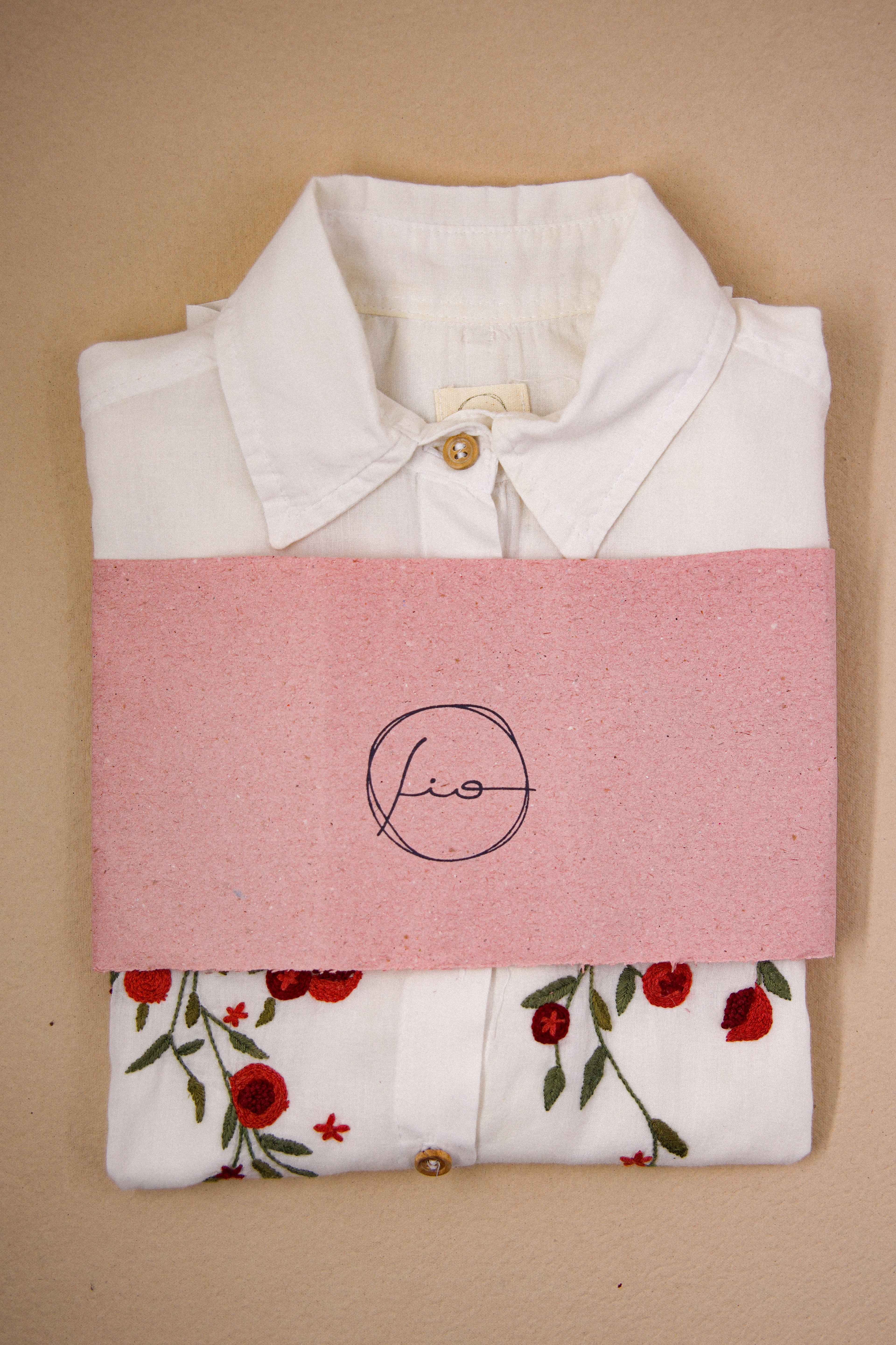
The logotype was hand-drawn in a calligraphic typeface, balancing simplicity and refinement. Its subtle irregularities intentionally evoke the precision and sensitivity of hand embroidery, reinforcing the brand’s commitment to crafted processes.
Circular forms became recurring graphic elements — referencing both the movement of thread and the cyclical nature of the production model. Textures, natural papers and tactile applications were incorporated to translate warmth and materiality across touchpoints.
In photography and art direction, the concept of “elegance through simplicity” guided visual decisions, creating an atmosphere that feels timeless, intimate and grounded in memory while remaining contemporary.

My Role
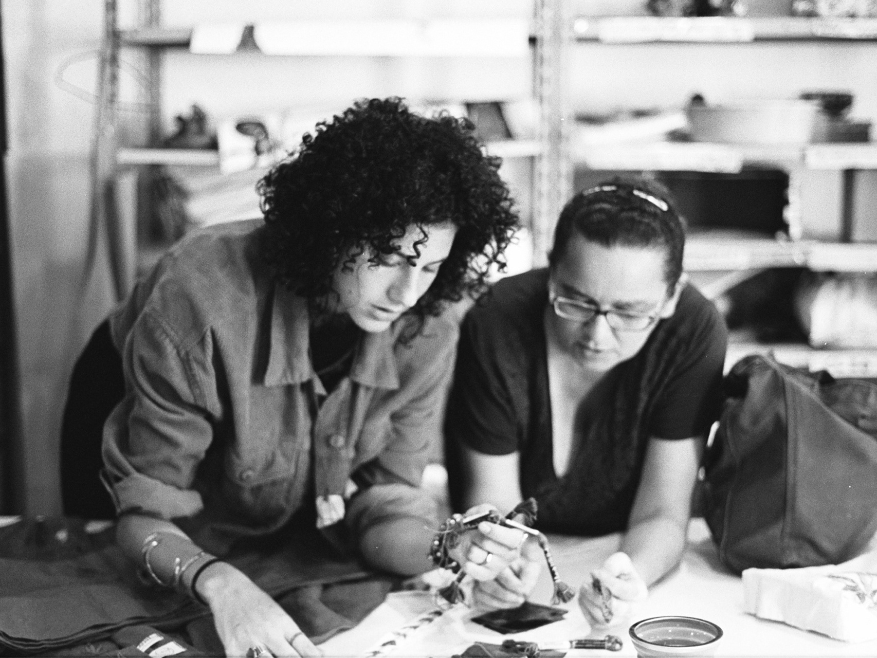
As co-founder, I led the strategic structuring and creative direction of the brand, operating across conceptual, strategic and executive layers of the business.
My role involved defining its foundation, translating core values into operational principles and designing a cohesive visual, narrative and communication system capable of supporting long-term positioning.
Beyond strategy, I was directly involved in implementation — from brand identity and product direction to the development of graphic materials and communication assets — ensuring consistency across all touchpoints and maintaining alignment between concept, production and market presence.
Projeto Fio represents a sustained exploration of how creative systems can honor memory, structure production and generate long-term cultural and economic value.